SEATTLE DEPARTMENT OF CONSTRUCTION AND INSPECTION WEBSITE
A tool for renters and housing prodivers anywhere in the leasing process
As a major hub of technology and industry, Seattle is a global beacon to some of the best and brightest. With so many newcomers arriving annually, The City of Seattle's Department of Construction and Inspection's (SDCI) website provides answers and tools a renter or landlord may need.
PROBLEM
The original Renting in Seattle site went unused, was difficult to navigate, and not in compliance with the rest of Seattle.gov branding.
COLLABORATOR
Fahmida Azim (illustrator)
ROLE
• Web Design
• Art Direction
TOOLS
• Illustrator
DESIGN
After meeting with the clients, we were all in agreement on the guiding principles
WHAT A comprehensive source to help renters and housing-providers
WHO Any resident of Seattle, with a focus on underserved unerrepresented communities
WHY As a public body, it is the duty of the SDCI to be public, transparent and benefitial
RESEARCH AND ANALYSIS
While SDCI provided the user data, I reviewed aparment finder services and similar government sites. To ensure SDCI clients could complete their tasks, I had to avoid (1) aggravatingly long lists of results and (2) poor site organization. My design had to have digestible content, clear information hierarchy, and be easily navigated.
SITE ARCHITECTURE AND FLOW
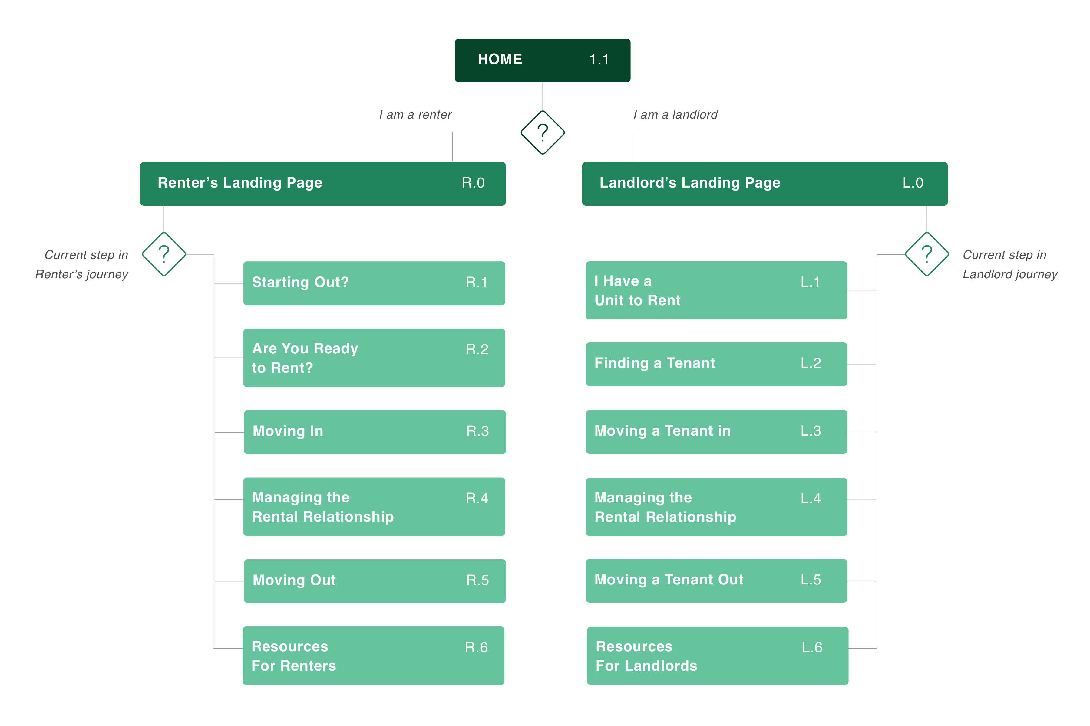
My team reevaluated the site's information architecture and, working with the client, created 2 distinct user flows — one path for renters and another for housing providers. In this simple yet effective flow, each path has 6 corresponding milestones ensuring transparency and easy navigation.
WIREFRAMING
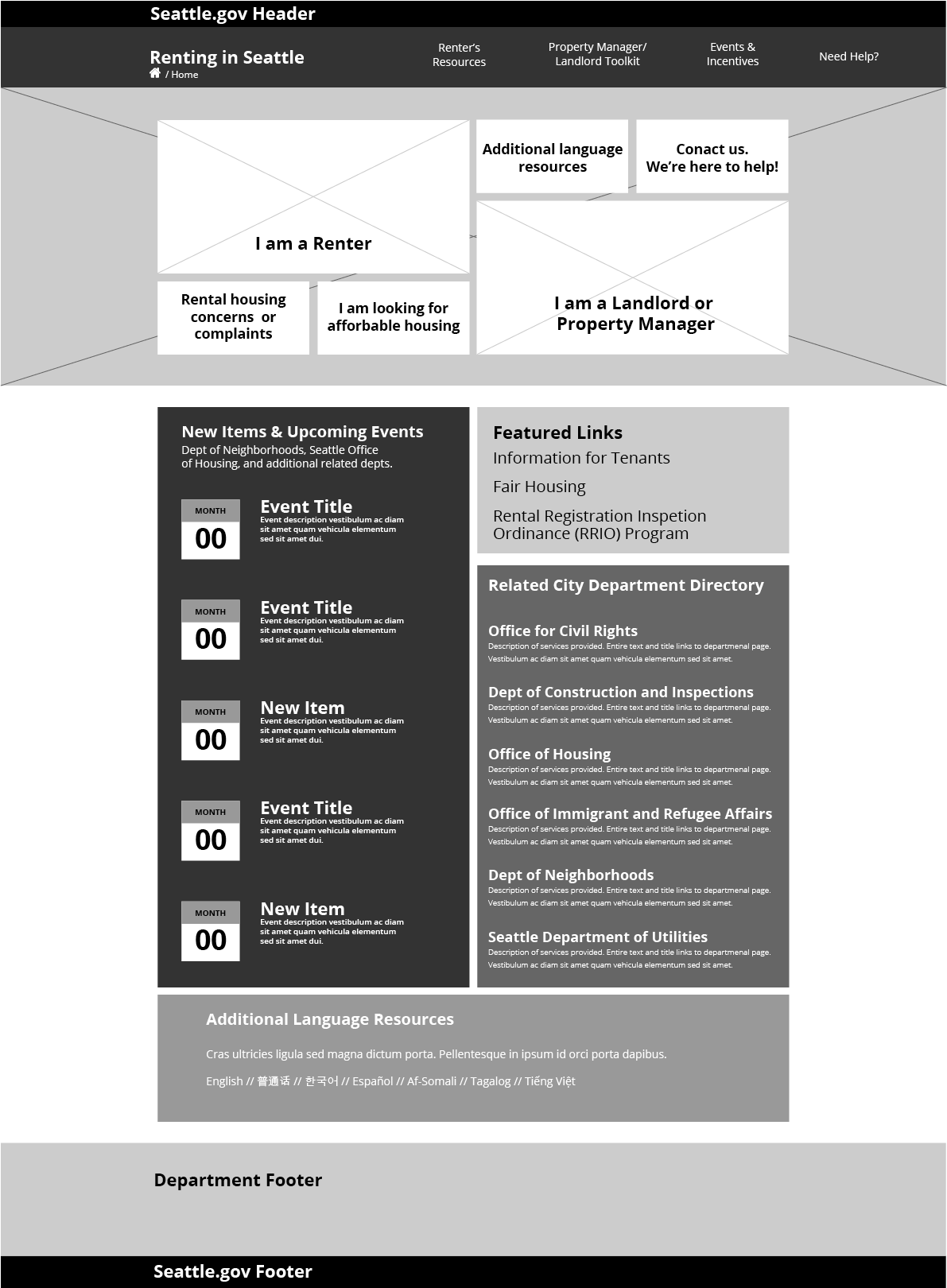
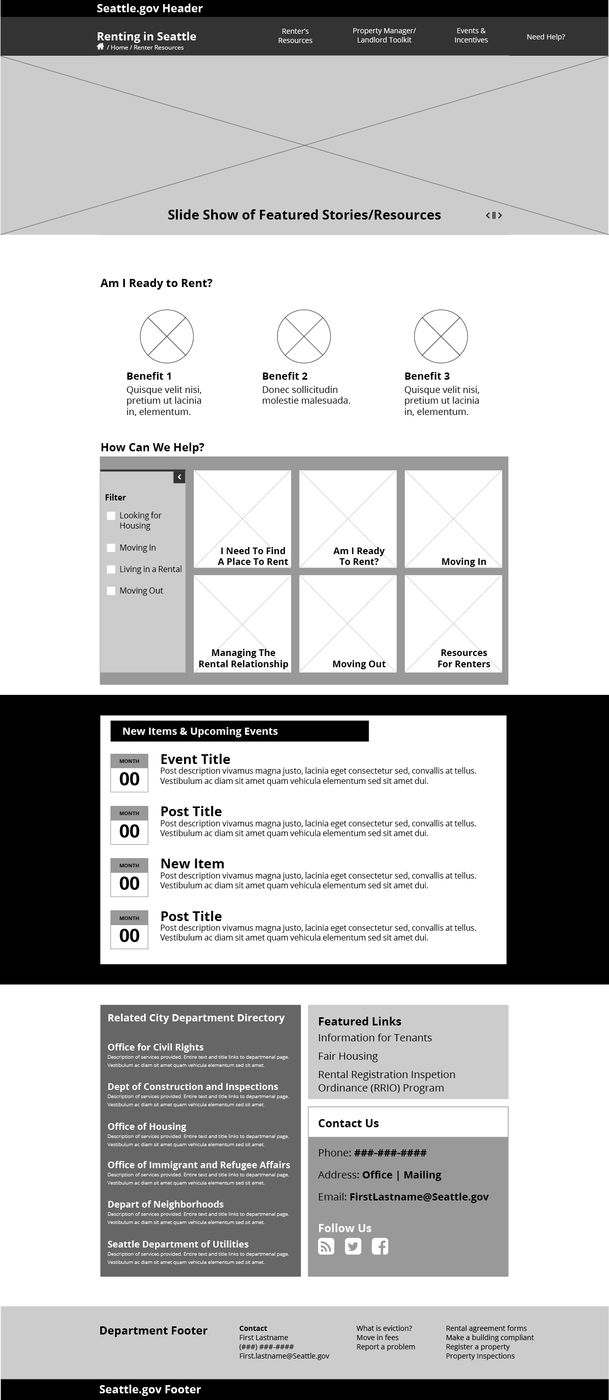
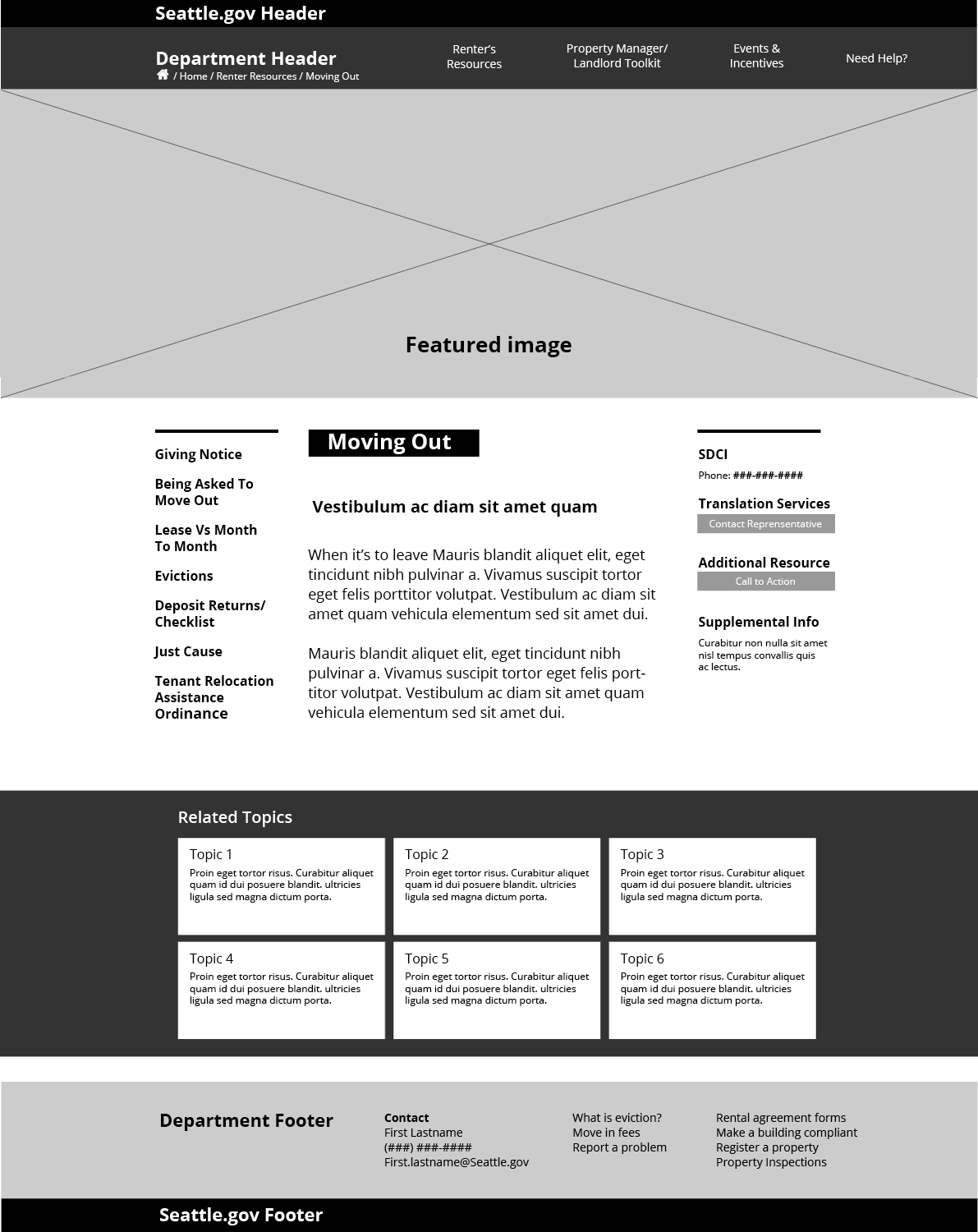
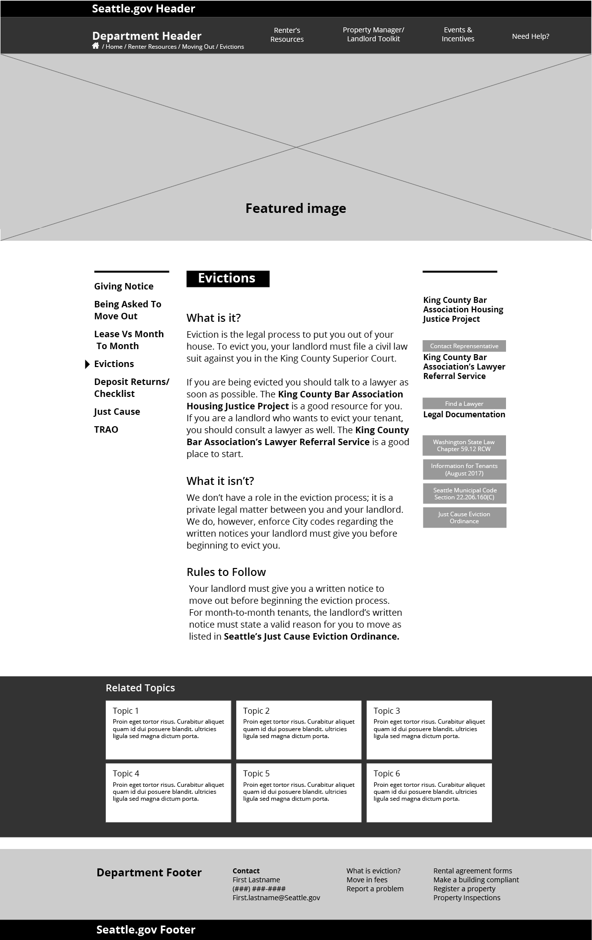
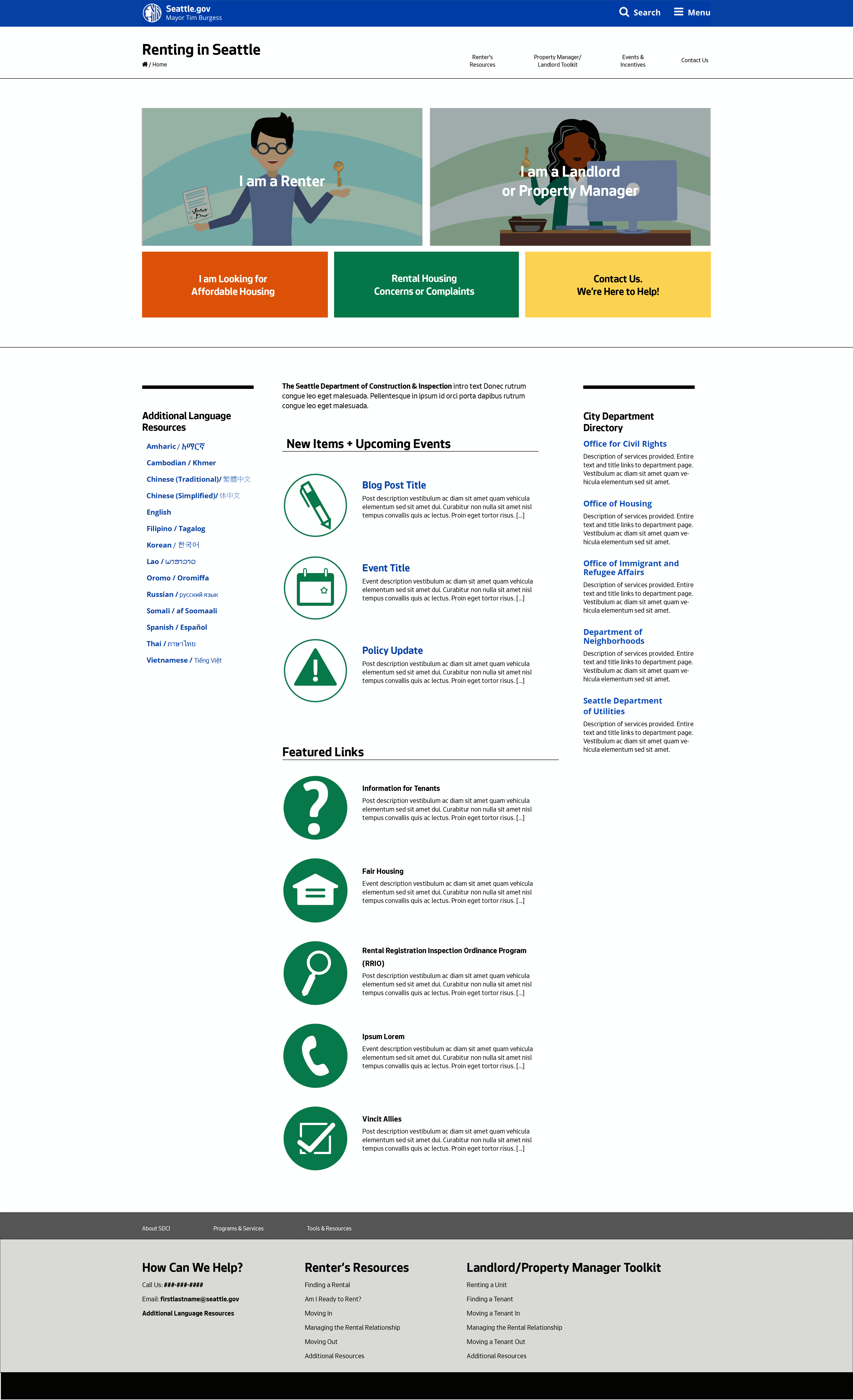
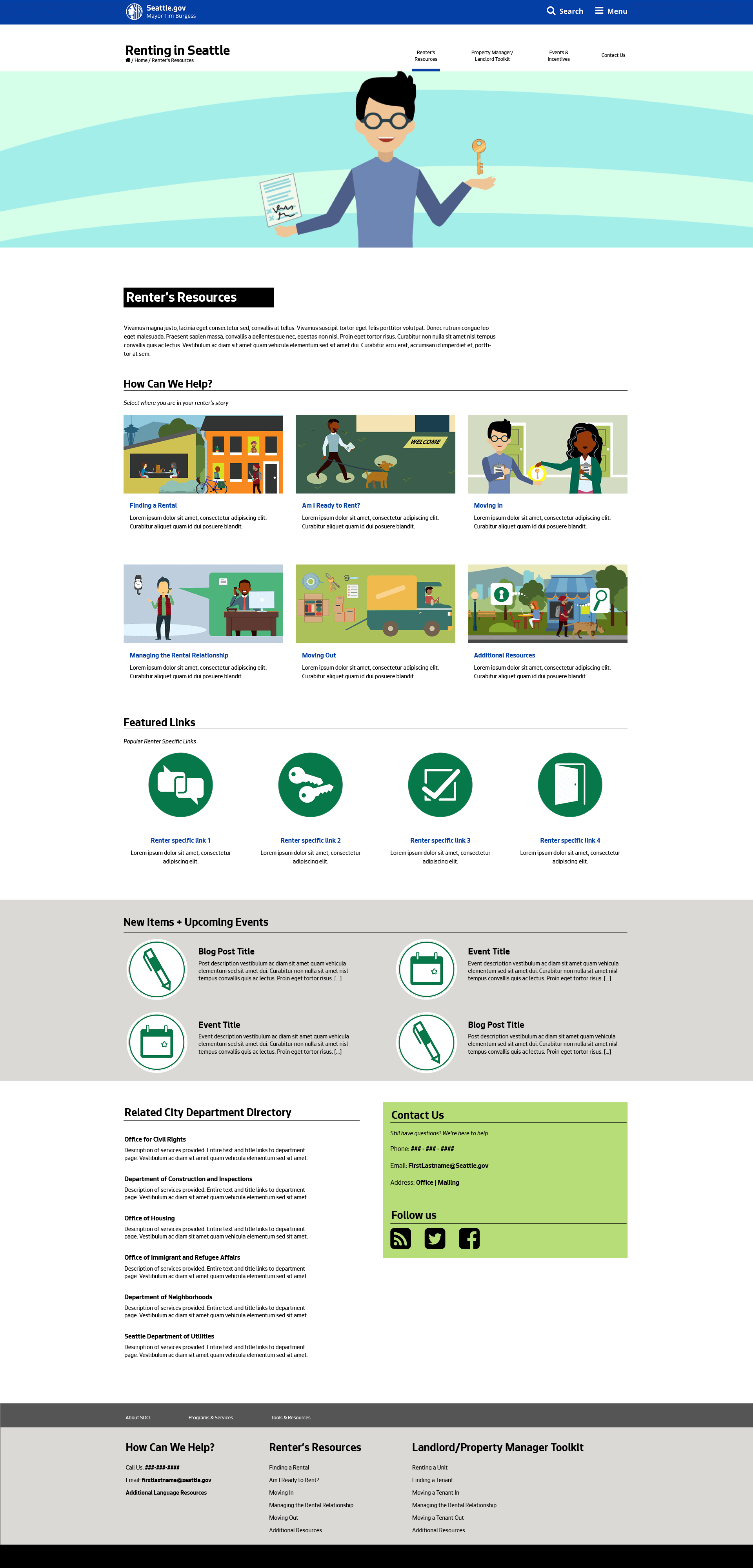
My designs began with City of Seattle visual guidelines. For design coherence in my page templates, I pulled from Seattle.gov web components and incorporated them into the pages. In the end, I provided four page templates that could address their needs. The new layouts have clearer hierarchy and are better organized making it easier for users to find approrriate information.
SCREENS
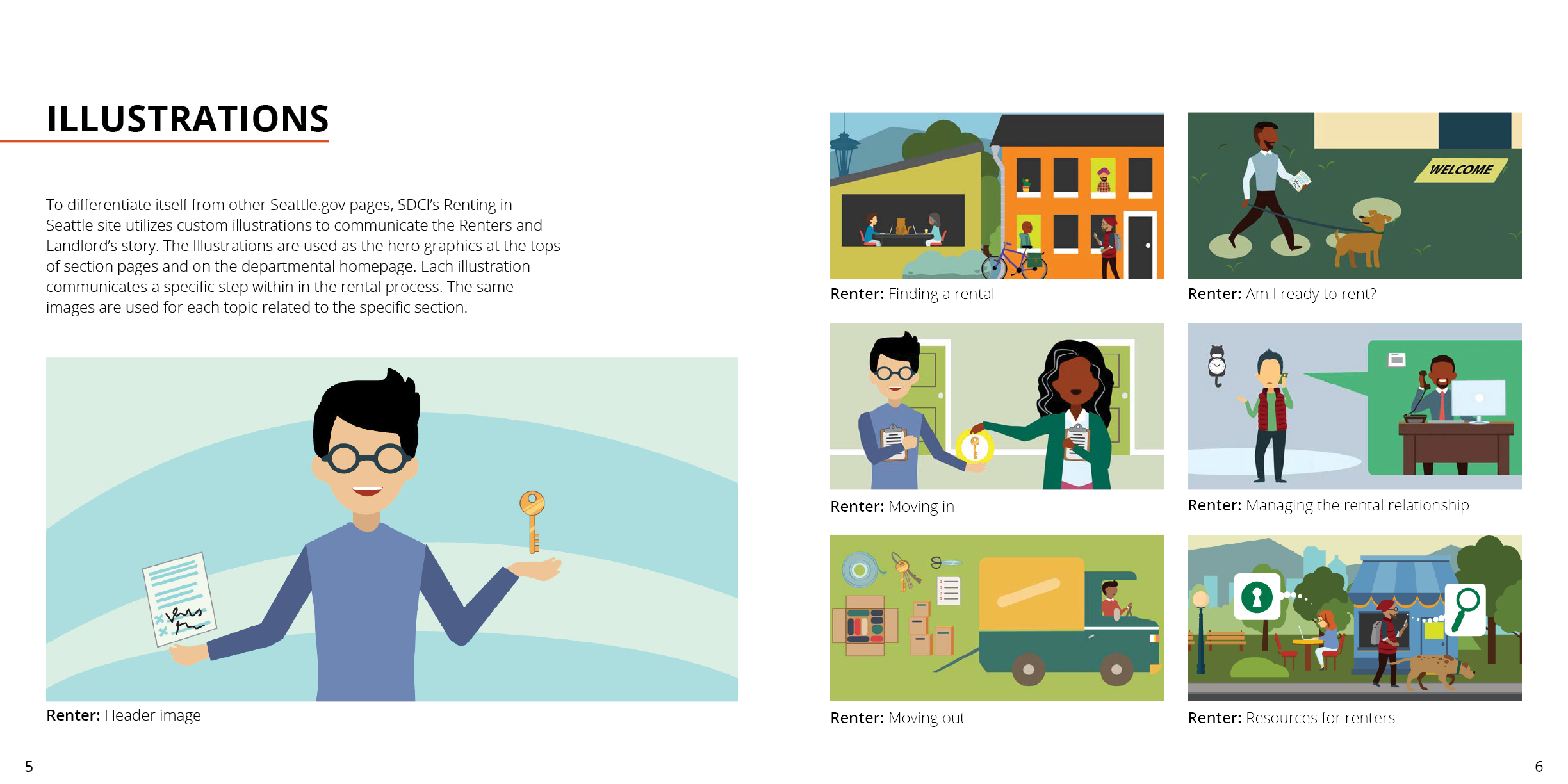
For the final screens, I oversaw Fahmida Azim, who created custom header and spot illustrations for the pages. These illustration feature prominently on all pages. During the process I remained in contact with the Seattle IT team, ideating and working with them to create custom features. Finalizing them early saved time down the road and ensured product viability.
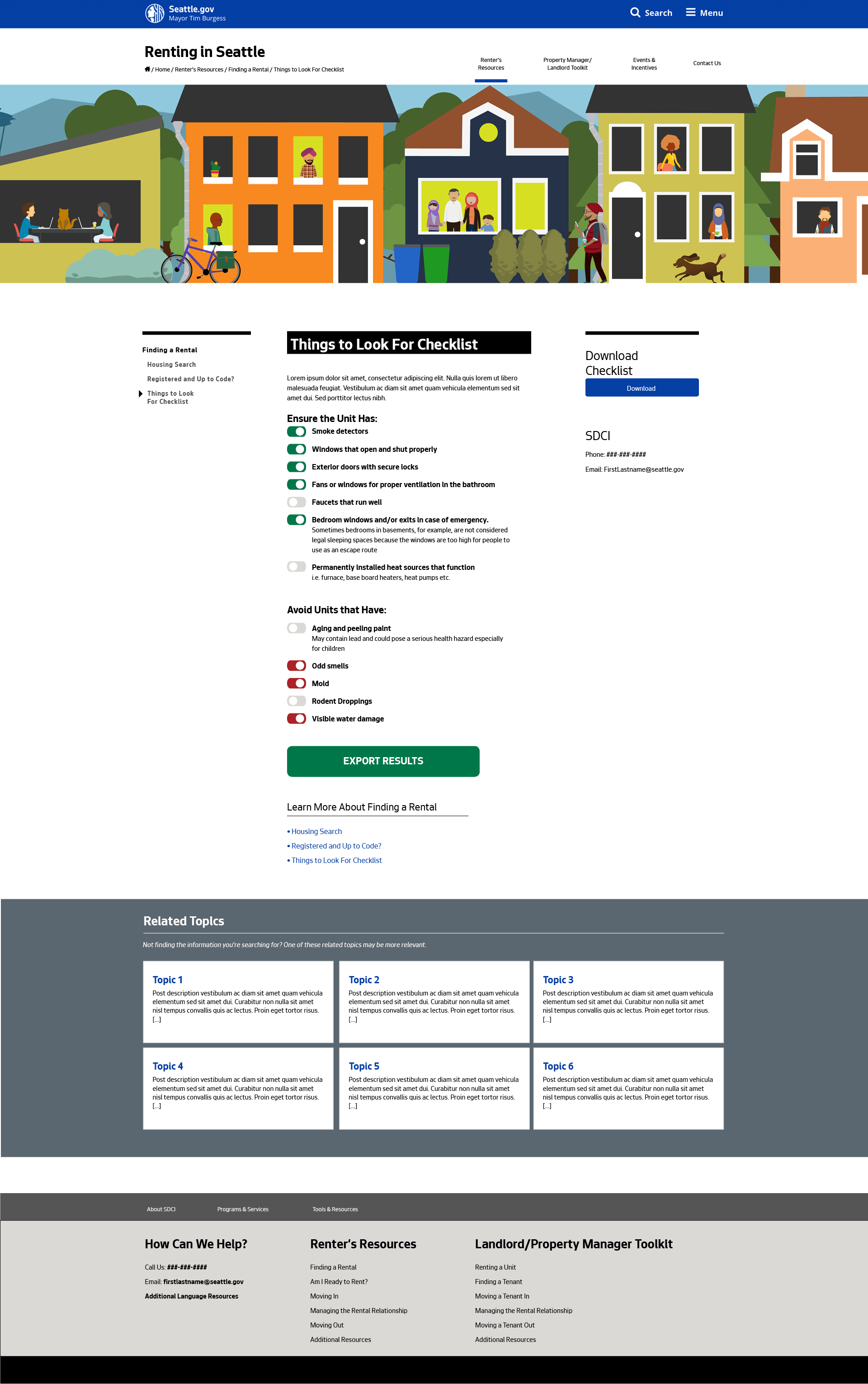
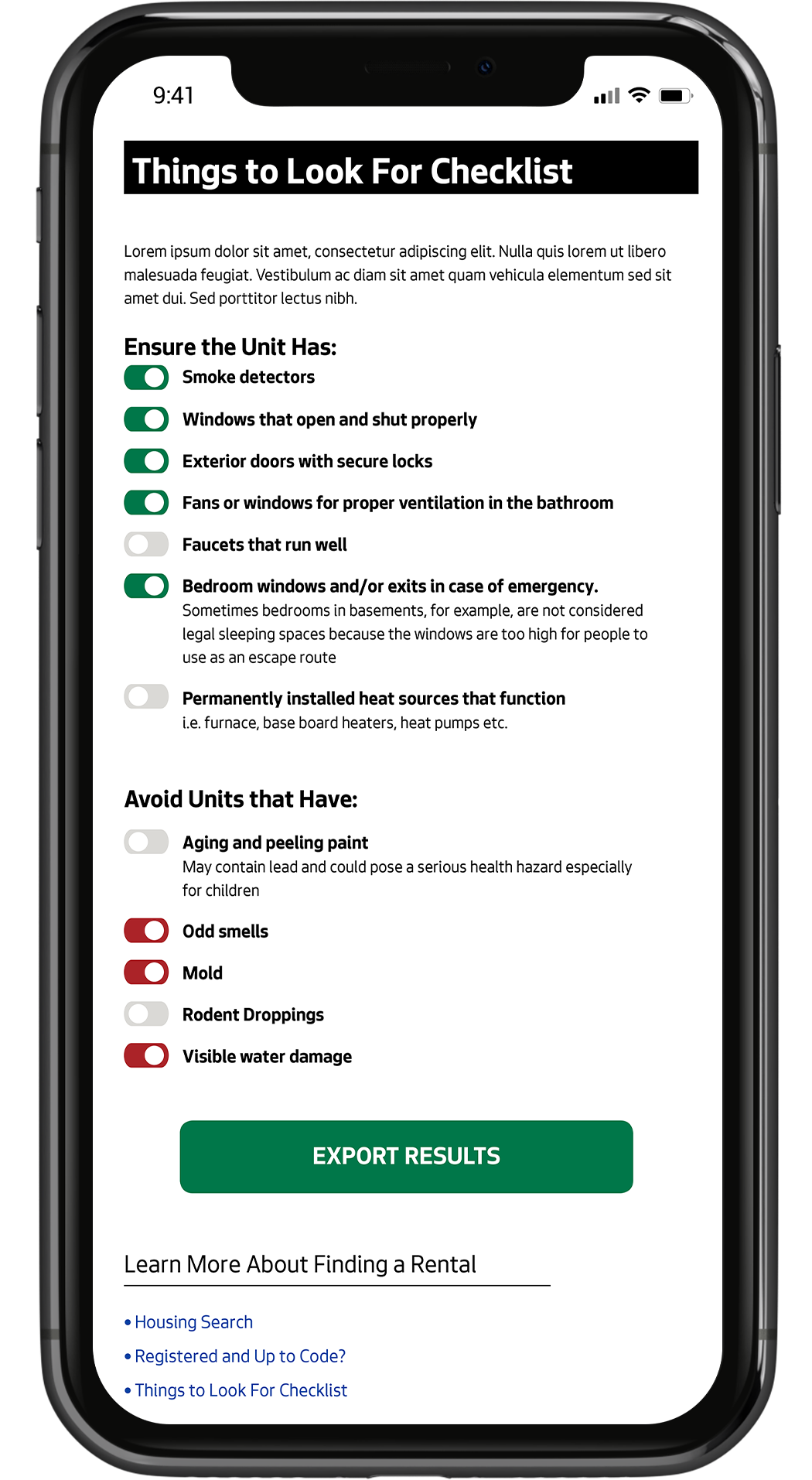
Additionally, I created a new feature that elevated the site from it's original design. Several pages were designed with checklists and an added toggle action, transforming them from something static to a pratical tool. Now, anyone mark off items on their mobile device while viewing an apartment, moving a tennant out, or any number of situations.
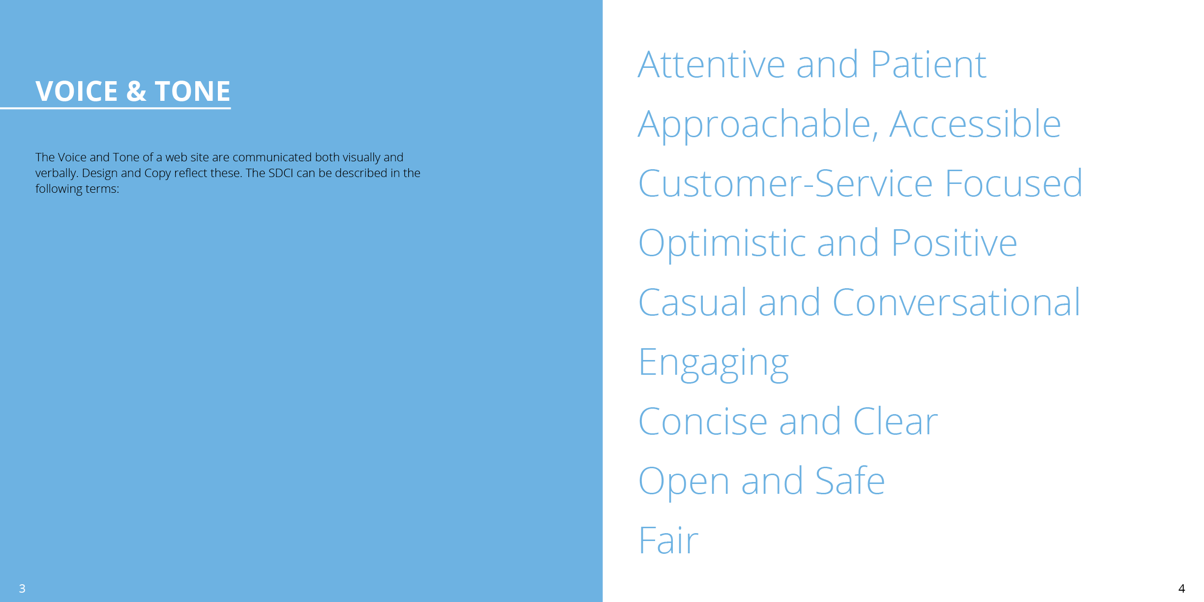
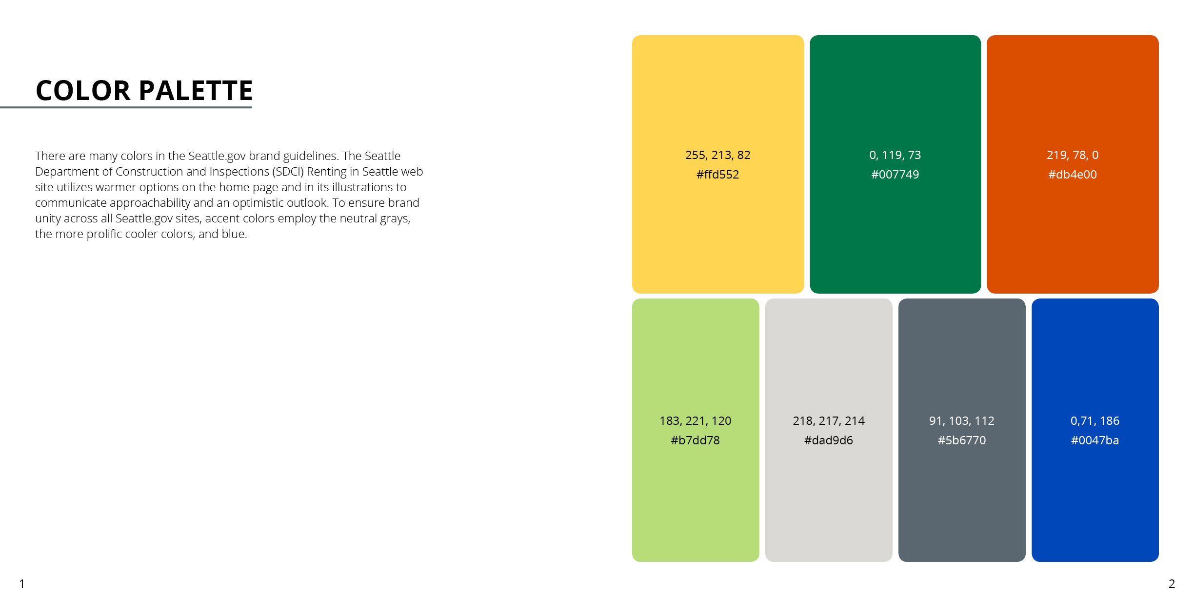
UI Toolkit + Style Guide
I created a UI toolkit and style guide for reference. The guide directs the client on matters including page layouts hierarchy, color use, typography and iconography. There is also explanation of all design decisions to guide the creation of future content.
