Microsoft Give
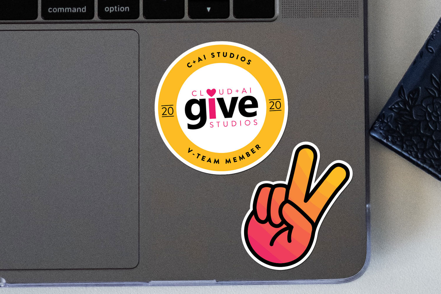
A giving campaign dating back to 1983 — Give supports Microsoft's employees' passion for charitable donations. I modified the original logo, creating several custom pieces for the Cloud + AI team. This established the branding that would be seen throughout October 2020.
Destination Sea-Tac
Destination Sea-Tac is a Port of Seattle project created to publicly document and chart the progress of the long term improvements to Sea-Tac airport. My original concept, seen below, was the basis for the version used on the project website and on signage at Sea-Tac airport.
DC Streetcar
The District Department of Transportation (DDOT) wanted to celebrate the first anniversary of the DC streetcar. This badge is a modern interpration of patches and insignias worn by streetcar operators.
The Heavy Düty
In the mid 2000's it seems like everyone had a pocast but only a few have survied. One of the casualties was The Heavy Düty. Hosted by friends Matt and Devon, the show reviewed music albums and live performaces, diving deep into band history and lore. The logo is a reference to the satanic imagery of heavy metal music and the nerd-like obsession both have for the genre.
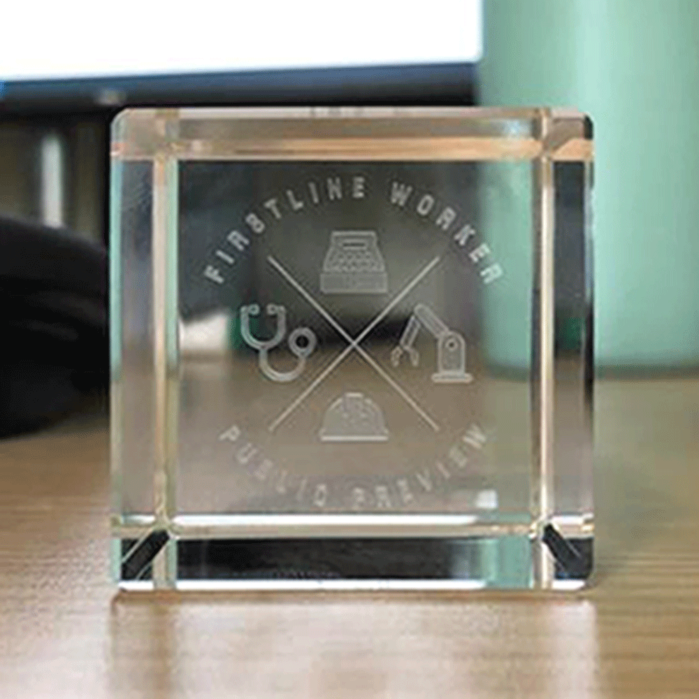
Frontline Worker Public Preview
I had the opportunity to work on a trophy commemorating a new Azure AD identity feature empowering essential Firstline Workers. I created a unique team logo referencing many of the industries utilizing this tool and worked with the vendor to create the final engraved trophies.
Elizabeth River Crossing
We were tasked with creating a badge commemorating 5 years of service by the operations and management team. The design seamlessly incoroporates several moden design elements into the original ERC's logo complimenting the existing look
Unknown ?layer
Local DJ and Emcee Uknown ?layer was looking to refine their visual identity. I provided them a logo using custom typography and a branding package to be used in social media, marketing, and at live events.
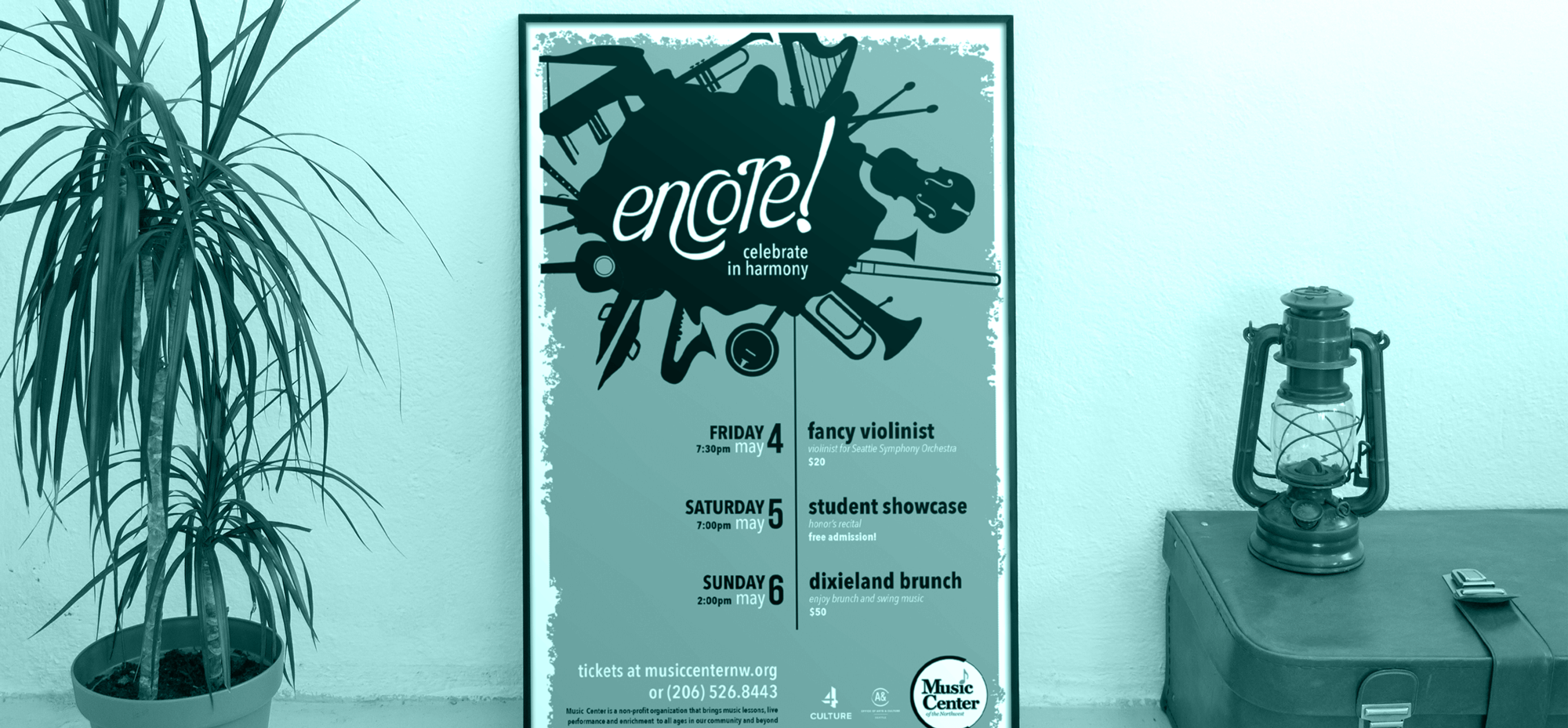
Music Center
of the Northwest
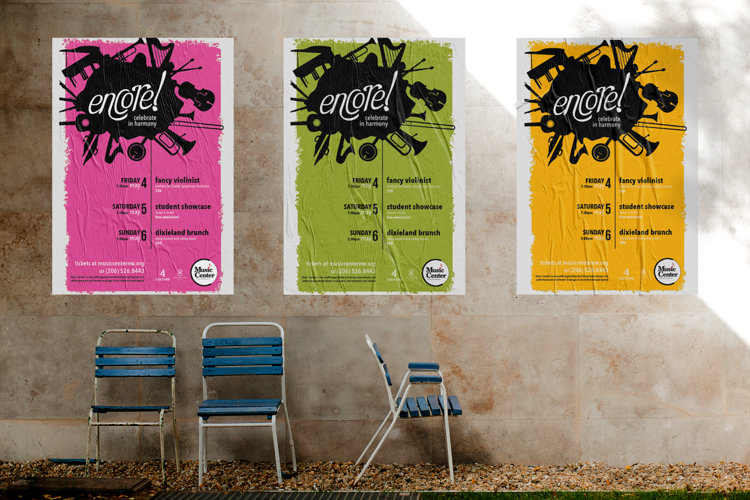
I participated in the Design Like Mad Seattle 2017, and was paired with the Music Center of the Northwest. Over the course of 12 hours my team met with our client, created a logo, poster, and social content for Encore!, a three day event and fundraiser.
Smart Water Meters
Bellevue Utilities is transitioning to smart water meters. An informational campaign was created to educate the public. This logo takes a very moden approach and visually incorporates water splashes and the Wifi symbol.
Express Market
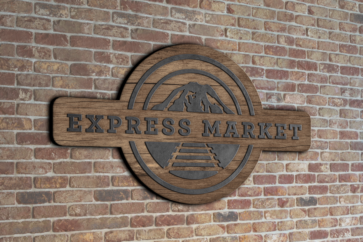
Construction was underway to transform Freighthouse Square in Tacome into an Amtrak station. Express Market received free signage and a new logo to help offset the expected impact to business. The logo features the south facing view of Rainier and is an homage to railroad signage — a nod to the history and future of the building.
Idea Foundry
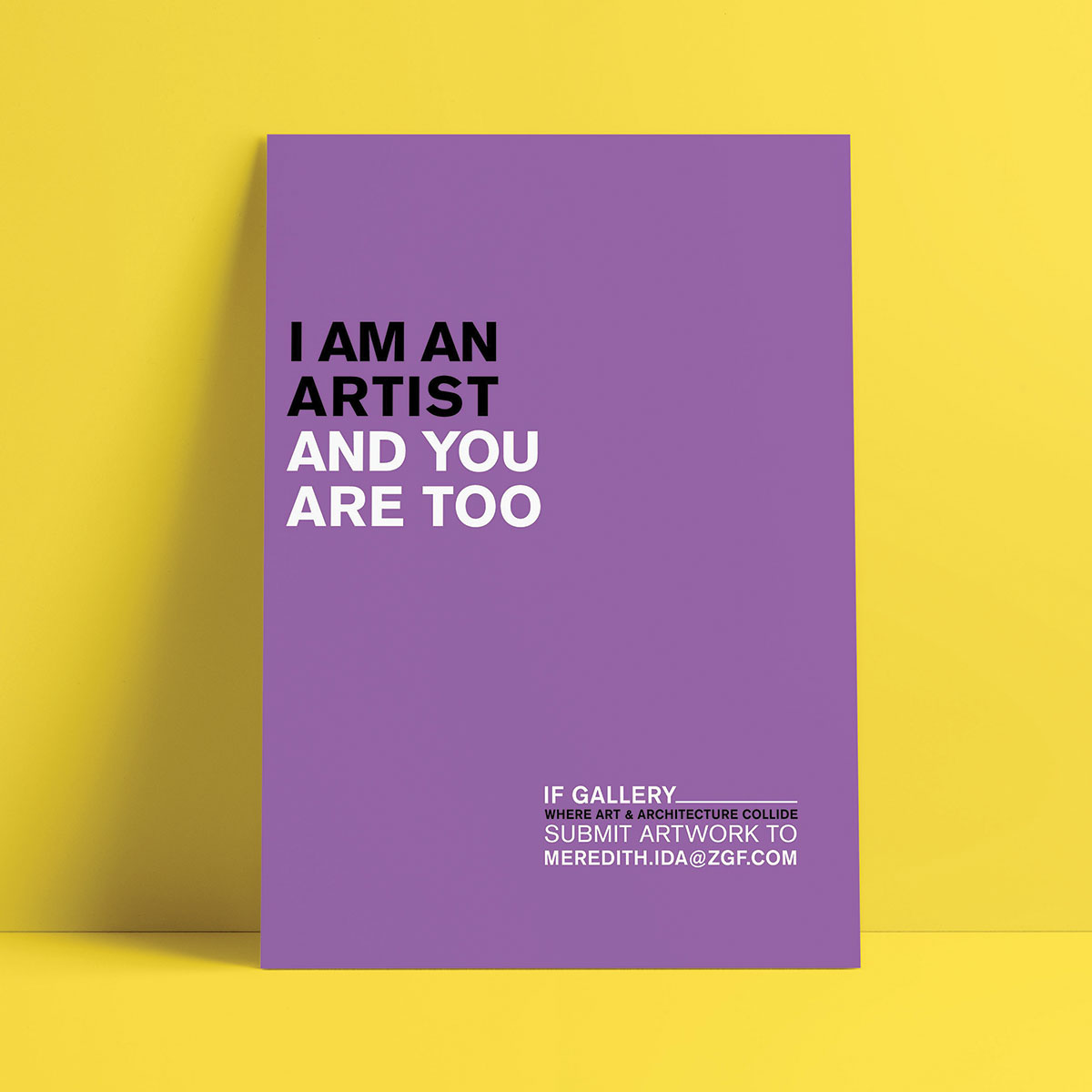
At ZGF architects I created a logo and poster series soliciting artwork submissions form coworkers. The look has a clean modern aesthetic pulling from current deisgn trends that use bright vivid colors with simple messages — both eye cathching and consumable.
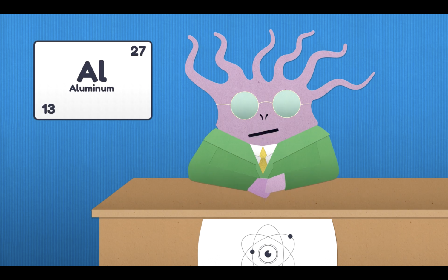
Escape the Vape
Created as part of the Escape the Vape campaign for Seattle and King County Public Health, the Atomic News Network logo sits on the front of the newscaster desk. Details like this help flesh out the campaign and create a more complete experience.
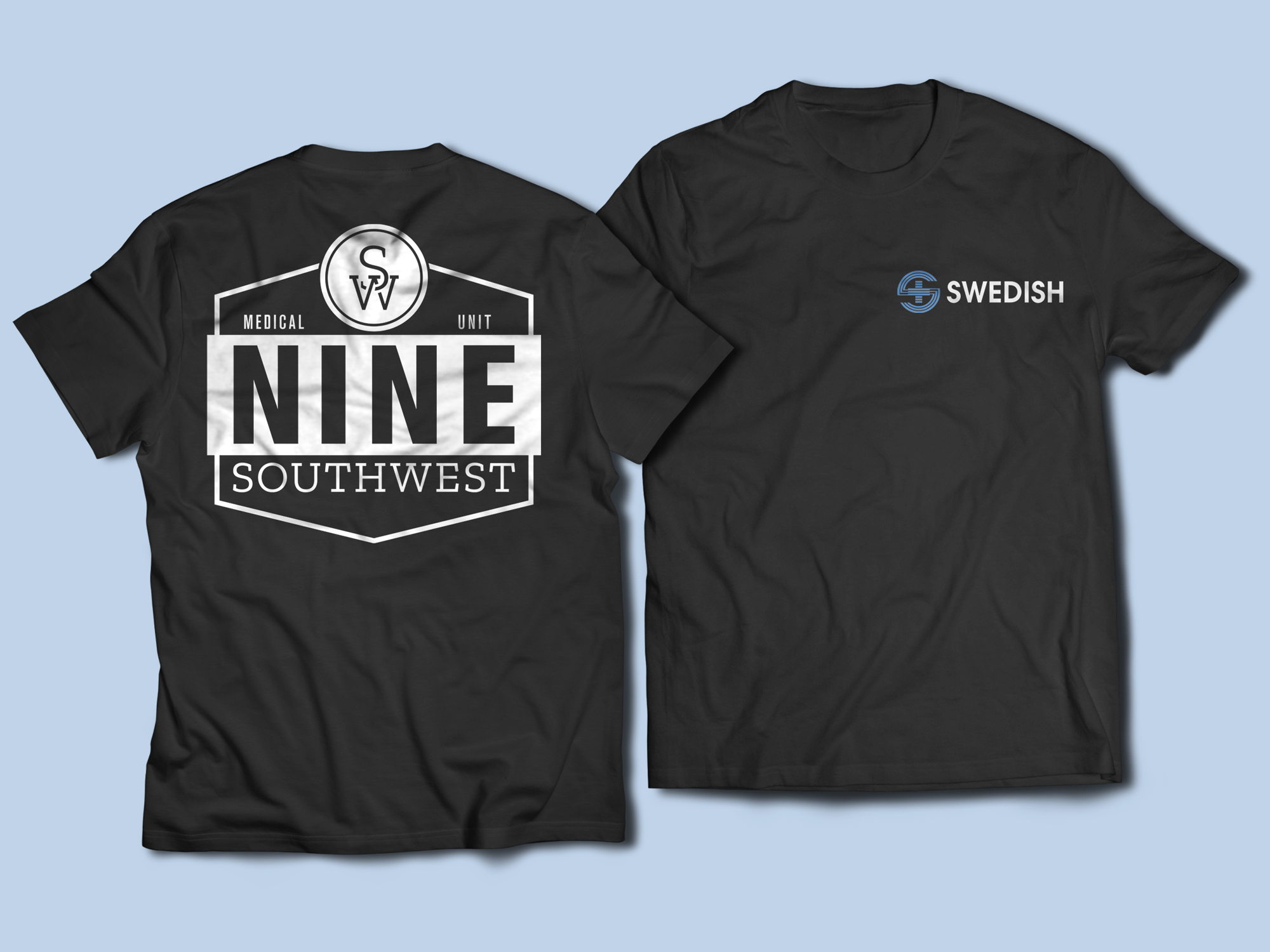
9 SouthWest
A logo created for my partner's nursing unit at Swedish hospital. I pulled from vintage racing brands to create something distinct that did not resemble anything in the healthcare industry.
